Wednesday, 24 October 2012
Monday, 15 October 2012
Main task (Music Magazine) brief:
The front page, contents and double page spread of a new music magazine.
- All images and text used must be original, produced by the candidate, minimum of FOUR images.


Evaluation
I have chosen to do a college
magazine instead of a school magazine as i feel that whilst I’m at college, I'd
be able to get more inspiration at college then just from my experience
at secondary school. I began to look at existing college
magazine covers on the internet. At first I thought it would be difficult to
analyse them, but from learning the key elements of a front cover in my media
lessons, i was able to complete a brief analysis of them (labelling an NME
magazine with elements such as 'mast head', 'main headline' and more)
As this isn't going towards our final grade and is preparing us for our music magazine, i felt that having to show our own examples of different camera angles has made me feel much more confident for when i actually take photographs. In this project, i chose to take a photograph of Jamie and Chloe, long shot, as i wanted them standing in front of a brick wall which made them stand out for when i add text to the image. I got my models to hold books as this will relate to some of the cover lines and main headline of the magazine; such as 'exam preparation'. As they are college students and holding books, it will look how the audience expects students to look (conventions).
When drafting my contents page and front cover i felt confident and enjoyed having to think of what i needed to include so the conventions of the cover and contents page were what to audience expected. I chose to set the Front cover like the green college magazine which i analysed. As for the contents page, i decided to use the layout used by 'Q' magazine contents which i labelled and analysed. I feel both layouts are simple yet eye catching and suit the expectations of the audience. When I got to the Photoshop stage of the task, i found this quiet easy and enjoyable from the preparation i had done for the task which made it simple. I wanted to use an image of a fellow student which i got to take a photo of in my photography class as he is stood in college grounds and it relates with the magazine as it is for wyke college.
Saturday, 13 October 2012


Wednesday, 10 October 2012

Monday, 8 October 2012


Wednesday, 3 October 2012


Analysis of exsisting college magazines and types of camera framings
Analysis of existing college magazines and types ofcamera framings
 Magazines
Thismagazine layout of the front cover to the right of this page is my favouritelayout as I believe it suits the purpose it has. It's a very simple layout,although, from my memory of my secondary school, their magazine was verysimple. They tended to use colours either relating to the school (school logowas green) so they would use green in their magazine. Most magazines I'velooked at tend to use the same font of text or two different fronts, one forthe Masthead and one for the main cover line (the rest of the text is usuallyin the same font as the cover line just smaller). This example is a house styleas there are two colours used. Although, there are three different text fontsused. When I create my college/school magazine i think i would rather use twodifferent fonts at the most. I like where the main cover line is placed in thecentre of the page, although, to attract students to buy the magazine I think Iwill include a plug splash such as "FREE MEMORY STICK - if you take partin extra curriculum". I'd also like to include a selling line whichrelates to the school/college like "create your futures". 
 Different types of camera framings
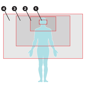
1. Thisis an extreme close up shot
2. Thisis a close up
3. Thisis a medium shot
4. Thisis a medium/long shot
5. Five is not on this diagrambut five would be a long shot if it had the whole body in the shot includingthe model's feet on the floor


Monday, 1 October 2012


Subscribe to:
Posts (Atom)