Analysis of existing college magazines and types ofcamera framings
 Magazines
Thismagazine layout of the front cover to the right of this page is my favouritelayout as I believe it suits the purpose it has. It's a very simple layout,although, from my memory of my secondary school, their magazine was verysimple. They tended to use colours either relating to the school (school logowas green) so they would use green in their magazine. Most magazines I'velooked at tend to use the same font of text or two different fronts, one forthe Masthead and one for the main cover line (the rest of the text is usuallyin the same font as the cover line just smaller). This example is a house styleas there are two colours used. Although, there are three different text fontsused. When I create my college/school magazine i think i would rather use twodifferent fonts at the most. I like where the main cover line is placed in thecentre of the page, although, to attract students to buy the magazine I think Iwill include a plug splash such as "FREE MEMORY STICK - if you take partin extra curriculum". I'd also like to include a selling line whichrelates to the school/college like "create your futures". 
 Different types of camera framings
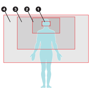
1. Thisis an extreme close up shot
2. Thisis a close up
3. Thisis a medium shot
4. Thisis a medium/long shot
5. Five is not on this diagrambut five would be a long shot if it had the whole body in the shot includingthe model's feet on the floor


No comments:
Post a Comment